Peach Fuzz – 2024 Is All About “Peach”
Peach fuzz, or more precisely Pantone 13-1023 Peach Fuzz, is the official color of the year 2024. It is a velvety-soft peach shade that we will encounter again and again this year in many areas, in fashion, accessories, graphics and various design areas. But where does the trend come from?
Peach Fuzz was named color of the year by Pantone, which is why you will be seeing “peach” more often this year, and not just in the form of juicy fruit. The fashion and accessories sector in particular likes to take its cue from the annual “it” colors. But who or what is Pantone to dictate a color to us so easily?
Pantone is an American company that was founded in New York in 1962. It has developed a color system that is used worldwide. It helps to considerably simplify communication about color matching, particularly in the production of printed matter and textiles. The standardized colors each have a number and designation and can therefore be assigned at any time. Incidentally, Pantone is an artificial word made up of pan (Greek πᾶν, “all-encompassing”) and tone (English color tone).

The Pantone Matching System (PMS) is based on 18 basic colors that are mixed together in various proportions to produce all the other colors in the system. It now comprises thousands of shades. The colors are presented in fan form (the Pantone Formula Guides) and in ring binder form (Pantone Solid Chips Books).
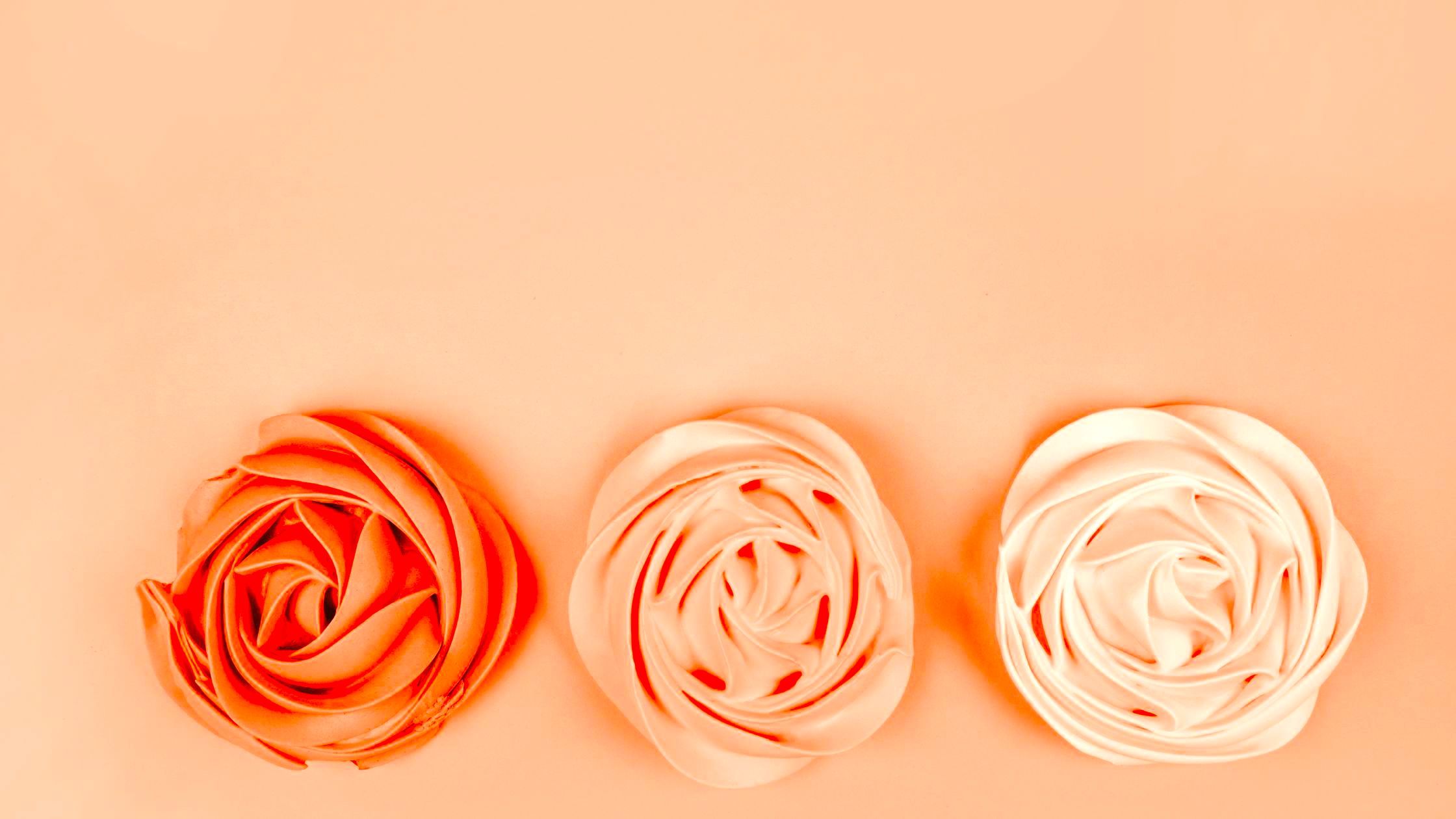
Enjoy warmth with Peach Fuzz
For 23 years, the Color Institute has selected a new color for each year. In 2023, for example, it was “Viva Magenta”. This year it is “Peach Fuzz”, a shade between pink and orange that conveys warmth. A color with a vintage atmosphere that reflects the past on the one hand, but also has a contemporary appeal in a modern interpretation. Peach Fuzz represents our desire to take care of ourselves and others.
“In developing a shade that reflects our inherent longing for closeness and connection, we chose a color that radiates warmth and modern elegance. This shade radiates compassion, is like a tangible embrace and effortlessly bridges the gap between youthfulness and timelessness,” says Leatrice Eiseman, Executive Director, Pantone Color Institute.

Laurie Pressman, Vice President of the Pantone Institute, explains why Peach Fuzz was chosen as Pantone Color of the Year 2024:
“At a time when so many areas of our lives are characterized by unrest and turmoil, our need for care, empathy and compassion is becoming ever stronger – as are our ideas of a more peaceful future. We are reminded of the importance of being healthy, resilient and strong in order to enjoy a fulfilling life.“
Caring for our inner self
“We feel that in a world that often emphasizes productivity and external accomplishments, it is so important to recognize the importance of caring for our own inner selves and finding moments of calm, creativity and connection with others in the hustle and bustle of modern life.
As we find our way through the present and work on a new world, we re-evaluate what is important. We realign how we want to live, we express ourselves more intentionally and thoughtfully. We rebalance our priorities in line with our inner values. We are focusing on our mental and physical health and well-being, and we are valuing what is special: the warmth and security we feel when we spend time with friends and family or when we simply take time for ourselves.“
A feeling of tangibility
She continues: “With this in mind, we wanted to choose a color that could focus on the importance of community and being with others. The color we chose as our Pantone Color of the Year 2024 should express our desire to be close to those we love. It should also convey the joy that comes when we allow ourselves to be one with who we are and simply enjoy a quiet moment with ourselves.


It should be a color whose warmth and inviting radiance conveys a message of compassion and empathy. A color that expresses caring and whose pleasant sensitivity can bring people together and trigger a feeling of tangibility. A color that reflects our consciousness from the days when everything seemed simpler, but at the same time radiates a more contemporary mood. A color whose soft brightness and airy presence lifts us into the future.“
If you have the choice…
How is the new Pantone color chosen every year and who selects it?
An exciting and long process. Anyone who thinks that a group of color experts lock themselves in a room for a day and then announce the good news of the “Pantone Color of the Year” in the evening is completely wrong. It is not determined at a single meeting of experts, but through careful deliberation and trend analysis. “This is the culmination of the macro-level color trend forecasting and research that the Pantone Color Institute’s global team conducts throughout the year,” says Laurie Pressman.
Many of the experts in the Institute’s team have their own design studios and deal with color and design, material and surface texture on a daily basis, making color decisions for the visual identity of products or brands or holding courses on the subject of color. They contribute to important, influential global trend forecasts. Incidentally, economic interests or personal preferences have no place in determining the color of the year. The Pantone Institute says: “All our colors are equally important to us.“
Laurie Pressman: “The members of the Pantone Color Institute team have diverse cultural, geographic and design backgrounds. What unites them is their expertise in color and design and their ability to see the world through the lens of color. That’s why I like to compare them to color anthropologists. They have this intuitive ability to translate what’s happening in the world into the language of color.“


Color psychology and color trend research
Ultimately, the Pantone Color of the Year reflects the spirit of the times. It reflects what is going on in global culture at the time. And in this respect, the diverse observations and new visual developments are quite similar. This is referred to as color psychology and color trend research. It is about connecting the mood of the global zeitgeist with the corresponding color family. The process of finding exactly the right shade of color is a major challenge for everyone involved. After all, it should convey the color message of the year.
An existing color doesn’t always hit the mark. “For the 2016 Pantone Color of the Year and the 2021 Pantone Color of the Year, we brought two colors together to tell our story,” recalls the Vice President of the Pantone Institute. “In 2016, it was a blend of two shades, 13-1520 Rose Quartz and 15-3919 Serenity, which together conveyed connection and well-being and a calming sense of order and peace. In 2021, our two independent colors, 17-5104 Ultimate Gray + 13-0647 Illuminating, emphasized how different elements come together to support each other.“
Even the name is a message
In 2022, a completely new color even had to be created because no suitable color could be found in the existing palette. The result was PANTONE 17-3938 Very Peri, a shade from the violet color spectrum that oscillates between the warmth of red and the coolness of blue.
The color name is not insignificant either, as it immediately evokes an image and an emotion in every viewer. Laurie Pressman: ” Peach Fuzz conveys a sense of kindness and tenderness, a message of caring and sharing, of community and collaboration. It conjures an atmosphere of calm and gives us a place to be, to feel, to heal and to blossom. Peach Fuzz is soulful, but also sweet and airy, evoking a new modernity.“
We can certainly look forward to seeing what form The Color of the Year will take over the next twelve months and how it will be received by end consumers. One thing I know for sure is that my new car will not come rolling in as a peach.

The Pantone colors of the past years:
- 2023: “Viva Magenta”
- 2022: “Very Peri”
- 2021: “Ultimate Gray” und “Illuminating”
- 2020: “Classic Blue”
- 2019: “Living Coral”
- 2018: “Ultra Violet”
- 2017: “Greenery”
- 2016: “Serenity” und “Rose Quartz”
- 2015: “Marsala”
- 2014: “Radiant Orchid”
- 2013: “Emerald”
- 2012: “Tangerine Tango”
- 2011: “Honeysuckle”
- 2010: “Turquoise”
- 2009: “Mimosa”
- 2008: “Blue Iris”
- 2007: “Chili Pepper”
- 2006: “Sand Dollar”
- 2005: “Blue Turquoise”
- 2004: “Tigerlily”
- 2003: “Aqua Sky”
- 2002: “True Red”
- 2001: “Fuchsia Rose”
- 2000: “Cerulean”

CultureAndCream Author from Munich
To travel during my profession as a beauty journalist was never enough for my. Also my six month on a world trip didn’t do it. It always attracts me to other cities, foreign countries, on roadtrips and places I don’t know yet. But I am not only interested in “culture” and “cream”, I am also fascinated by people who have stories to tell . Such unique experiences I want to share with you.